As a vendor, selling curriculums into schools and districts is a difficult process. For educators, it’s a long and arduous process to find, adopt, and approve a new curriculum. In 2019, with this problem in mind, Timeri Tolnay launched EdCuration, an online marketplace that brings together buyers and sellers of instructional materials to help get better learning programs into classrooms, faster.

EdCuration’s goal is to become the place that educators come to first when they are shopping around for new curriculums. The company reached a roadblock when they realized that many vendors were not completing their product listings. You see, in order to attract educators and keep them coming back, it’s important for EdCuration to have a lot of great learning solutions on offer, and it’s vital that each product contains the key information that educators need to make their buying decisions.
EdCuration came to the UX Design Team at Beginex looking for a more effective and intuitive way for instructional materials providers (aka “vendors”) to sign up, create a company profile, list and describe products and receive inquiries from potential customers. I was the lead UX designer on a team with a UX researcher and two UX designers.
I worked closely with my team over the course of 10 weeks. The project was kicked off with a stakeholder meeting that included the CEO of EdCuration to get a better understanding of the business goals and requirements. This diagram is a snapshot of the process I followed.

First, I needed a better understanding of the users, their needs, and the EdCuration platform.
I set out a few research goals and decided on the best research methods to achieve them:
1. Learn as much as possible about the EdCuration platform
heuristic evaluation
2. Learn as much as possible about users
user interviews & usability testing
3. Understand current solutions and the competitive landscape
comparative analysis
The purpose of the heuristic evaluation was to quickly and easily find usability problems related to vendor signup and product listing. I went through the signup and product listing process while assessing the site against Jakob Nielsen's 10 general principles for interaction design. Below are the key issues I discovered.
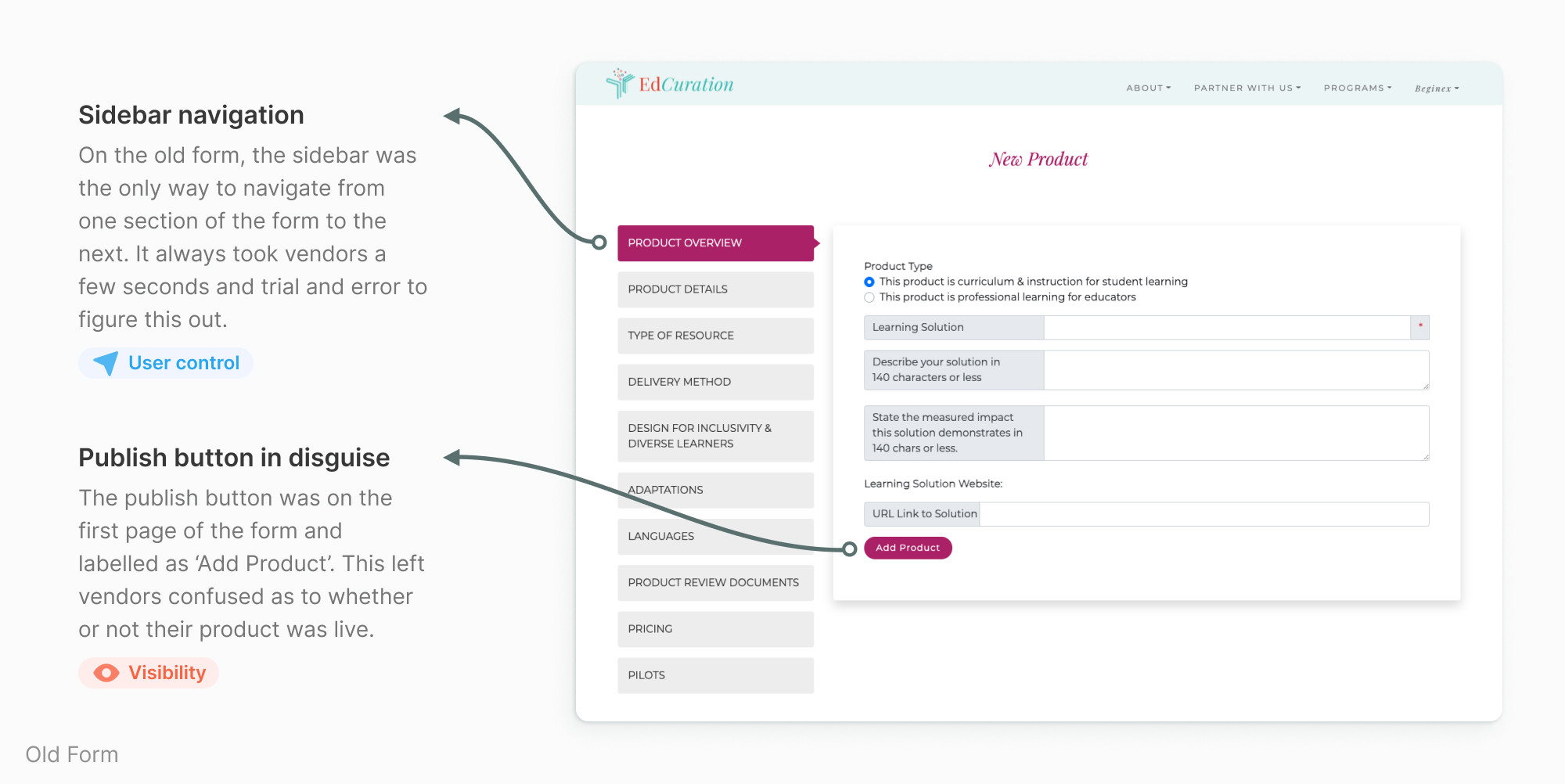
Vendors don’t have any control or indication as to when their product listing is published and live.
Labels and placeholder text throughout the form are often unclear and difficult to understand.
The only way to move from one section to the next in the form is to use the sidebar.
Inconsistencies in language and terms, and button placement throughout the form.
My goal was to learn from the steps vendors took to list their products on the platform. I wanted to find out if the process was easy for them, if there were any parts they were getting stuck on, and what they liked or disliked about the process. I used affinity mapping to pull out common themes and patterns among users.

Vendors found it difficult to answer some questions because of unclear language, lack of guidance, and confusing terminology.
Vendors found the current form wasn’t always flexible enough, they often felt pigeonholed and wanted more options.
Vendors weren’t always sure how to move from one section of the form to the other.
Vendors were unsure whether they had successfully completed an action.
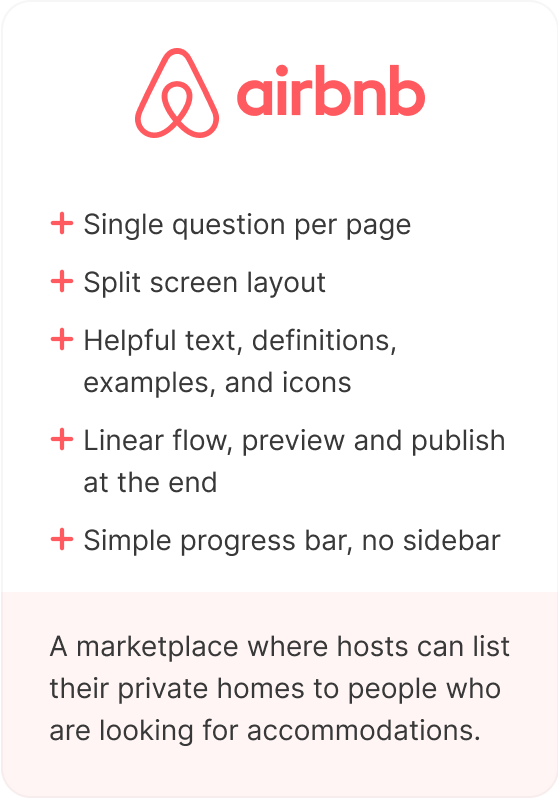
EdCuration is the first of its kind and so doesn’t have any direct competitors. Instead, I identified four online marketplaces that require ‘sellers’ to fill out long forms in order to list their products. I looked at their user flows and the key features and incentives they offer to encourage users to complete their product listings.


At this stage, it was time to redefine the goal and narrow down its scope based on the insights gained from users.
Vendors need a form that is easy to navigate, gives clear instructions, uses consistent terminology, and provides flexibility so that they can get their products into the hands of more educators.
With user insights and a re-defined problem statement in hand, it was time to come up with solutions and validate them.
I held a remote crazy eights session with stakeholders to ideate on the layout and flow of the product listing form and voted on our favorite ideas and elements.


I focused on the following improvements when designing the initial low-fidelity wireframes.
One of the key differences in the updated designs was that vendors could not move freely around the form or publish/preview their listing until all required questions had been answered.
I built a mid-fidelity prototype to validate initial design solution. I wanted to know if the redesign had solved some of the problems around clarity, flexibility, and navigation.


Using insights gained from usability testing and design critiques, I iterated on the wireframes and visual design. The following sections highlight key improvements that were made to the product form and the journey.
I wanted to make sure each product listing on the EdCuration marketplace contained all the key information educators were looking for.
The original form contained 30+ questions but only one was required – product name. This meant vendors could publish their product listings with very little content. To address this problem, I wanted to increase the number of required questions.

To determine which questions should be required, I talked to vendors, educators, and EdCuration to find out what’s most important to them.

The new form has 16 required questions. A product listing can’t be published without answering them. This ensures all products on the marketplace contain the key information educators need to make their decision.
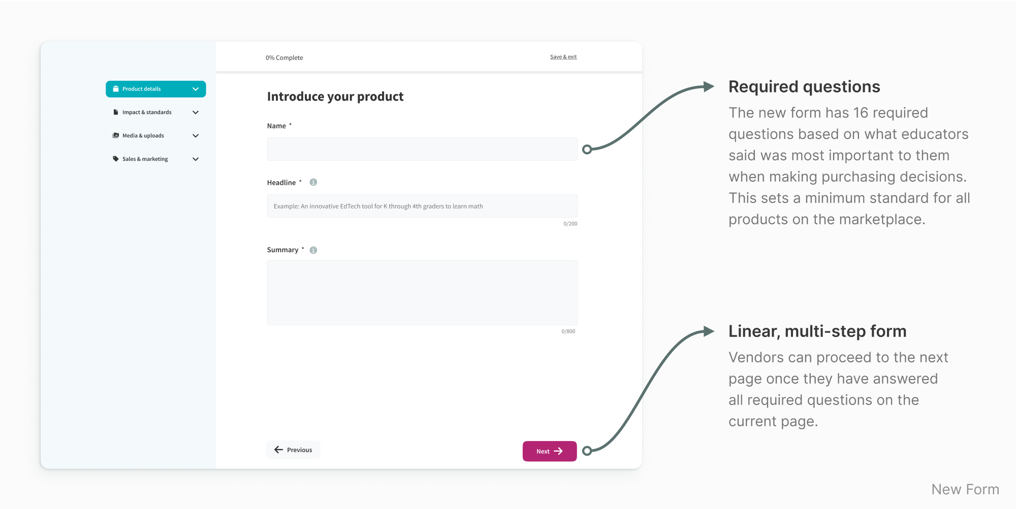
I iterated over the flow of the form a couple of times to make sure it was right.
The new form is a multi-page form with fewer questions per page, making for a less distracting and less intimidating experience. Vendors move through the form in a linear way, going through each section in sequence.
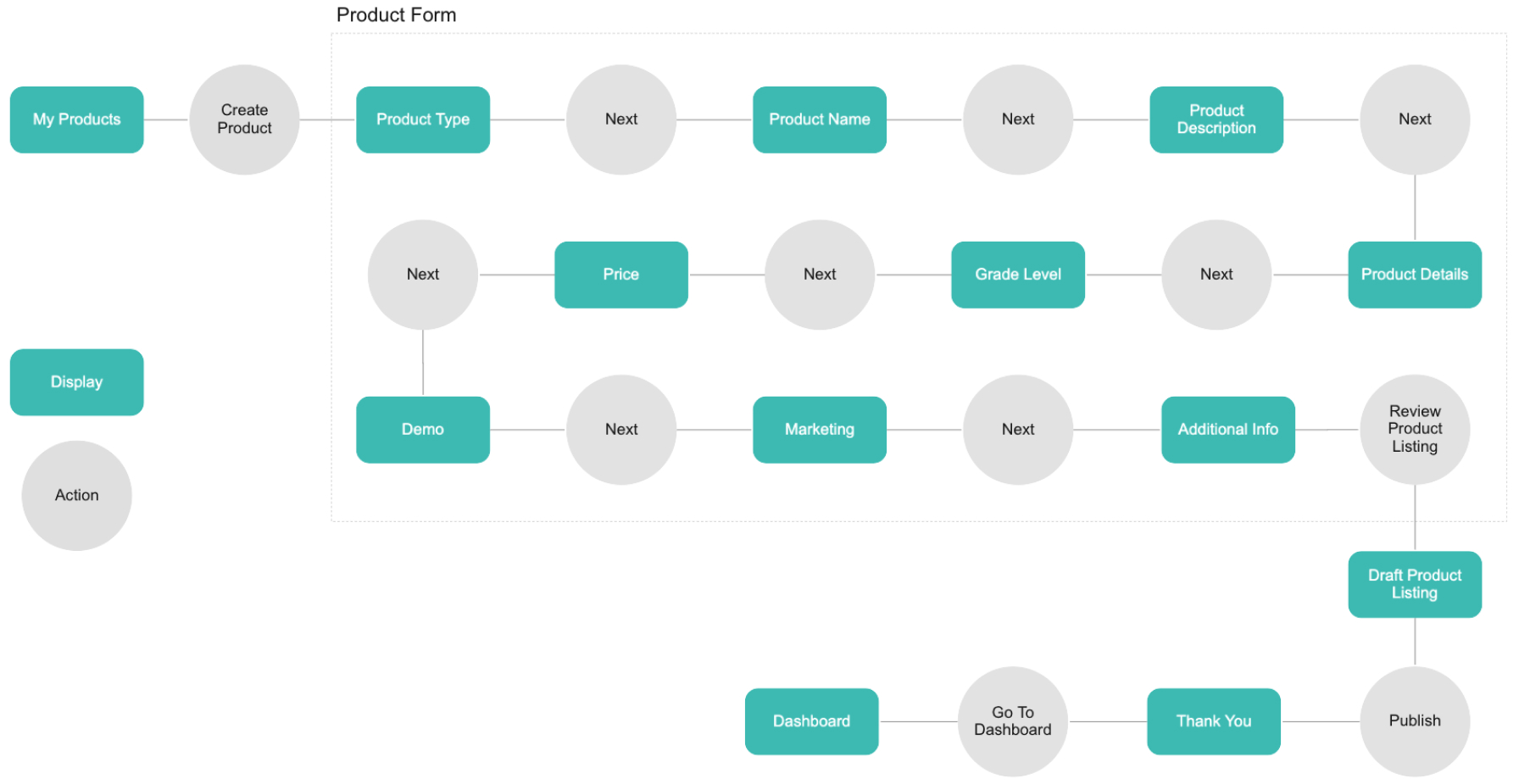
At first, I tried grouping all required questions upfront so that vendors could publish as soon as possible. But in testing, none of the users chose to publish early – each vendor wanted to go through all the questions.
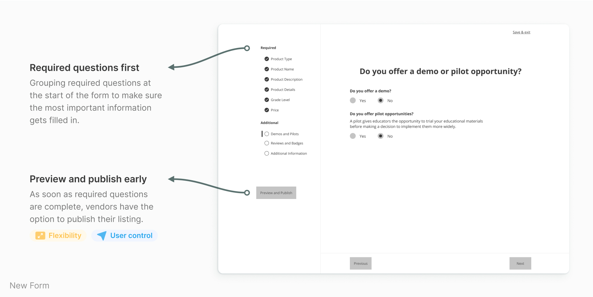
In the end, to improve the flow of the form, I spread out the required questions, re-organized the content into more logical groupings, and reduced the number of questions per page.

Lack of clarity and guidance was an issue from the very beginning.
Field labels were not always clear and vendors were having a hard time filling them in correctly. This left them feeling confused and frustrated.

I added clear labels and helpful instructions throughout the form. Vendors responded very positively to this in usability testing.

The form was starting to feel heavy under the weight of all the added copy, so I introduced patterns like dismissable messages, tooltips, and popup modals. This kept the form feeling light and short while still providing guidance to vendors.

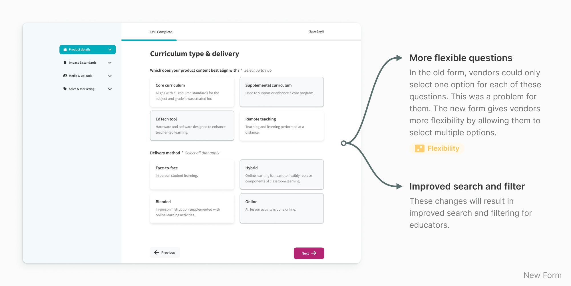
The existing form wasn’t flexible enough for the diversity of products, so I worked with vendors to improve it.
I managed to make the form a little more flexible in the first iteration, but in the usability tests vendors still wanted more flexibility.
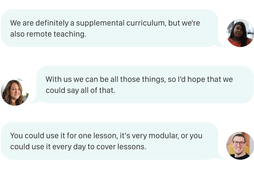
Some questions now allow for multiple selections. This means more accurate product listings and better search results for educators.
I introduced more pricing options to more accurately reflect the different ways in which vendors price their products.

Many of the questions only apply to a few vendors. These new add links remove clutter from the page and are easily scannable by users.

Navigating the original form was a source of confusion for vendors.
The only way to navigate through the old form was the sidebar — this wasn’t intuitive for vendors. They were also unsure of the status of their product listing as they filled out the form. They didn't realize their product went live when they clicked the ‘Add product’ button on the first page of the form.
I introduced familiar navigation patterns including Next and Previous buttons and a Save & Exit link.

The sidebar has been updated so that it’s collapsible. I can only be used to navigate back to completed sections of the form (not forward). A progress bar has also been added to the top of each screen to let users know how much of the form they’ve completed.

I added a Preview button to the last page of the form. Once vendors are satisfied with their product listing, they can click the Publish button.

The existing form wasn’t flexible enough for the diversity of products, so I worked with vendors to improve it.
The updated product listing form is easier to navigate, provides clear guidance and instructions, and is flexible for vendors to use.

Ease of use and satisfaction were two key metrics that were measured during the generative research phase and the second usability test. While the design solution had not yet been implemented on the live site at the time this case study was written, I was able to see that the redesign had a positive impact on users.
I asked users how easy the new form was to use. 83% of users agreed that it was easy to use, up from 25% compared to the original form.
I asked users how satisfied they were with the redesigned product listing process. 66% of users were extremely satisfied, up from 25% compared to the original form.
I believe that these improvements will translate into a higher rate of complete product listing on EdCuration’s marketplace, and in turn, more leads for vendors.
In order to further improve the vendor experience on EdCuration, I suggest a few next steps: